Page 1 of 1
One that didn't make it...

Posted:
Mon Sep 19, 2005 10:08 amby Geoff
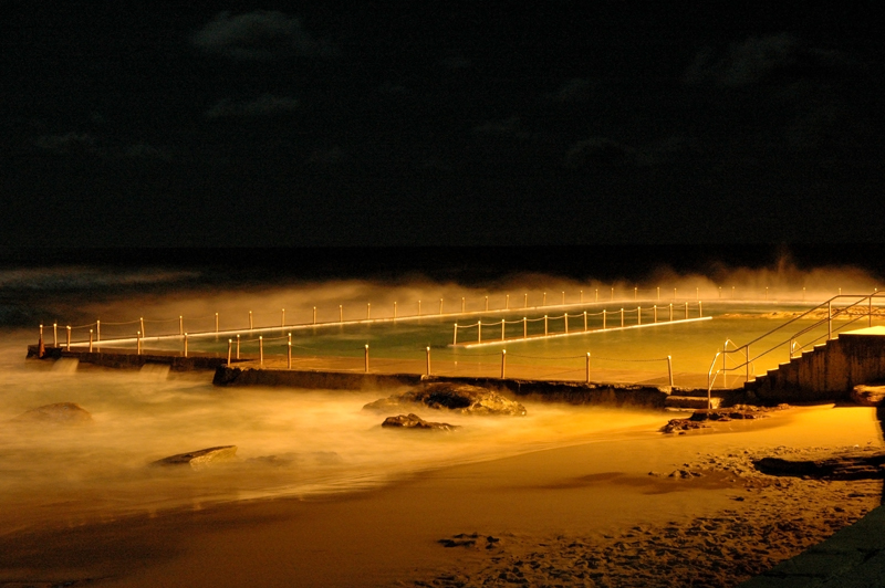
Well challenege 6 for me was a bit of a last minute (well nearly) rush, and there were a few that I had to choose from in the end. This is one I didn't submit. Critique as always welcome.
Posted:
Mon Sep 19, 2005 10:10 amby Manta
WOW.

I'm pleased you didn't put it in Geoff - would have made it all the more harder for the rest of us to get a look in.
I love it.
Posted:
Mon Sep 19, 2005 10:13 amby Oneputt
That is a very interesting image which I like.

Is there any chance that you could bring out a little bit more cloud detail?
Posted:
Mon Sep 19, 2005 10:34 amby stubbsy
Geoff
This is a great shot, but I'd remove a little of the orange colour cast and add some blue. This would in turn (most likely) bring up the clouds.
Posted:
Mon Sep 19, 2005 10:38 amby Geoff
stubbsy wrote:Geoff
This is a great shot, but I'd remove a little of the orange colour cast and add some blue. This would in turn (most likely) bring up the clouds.
Thanx Peter and everyone. I will try now to reduce the colour cast, and add the blue as suggested. It was a bit difficult cos the pool was lit with two huge flood lights!
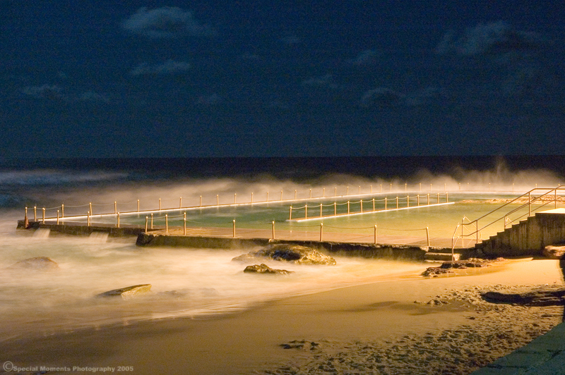
Decreased Temperature. Increased exposure and added some more blue.
Posted:
Mon Sep 19, 2005 10:43 amby Killakoala
Pe-white balance probably would have looked more natural, but i quite like the orange colour caste on this image anyway. I think it looks great.
If this is the quality of image you didn't submit, i can't wait to see the one you did.

Posted:
Mon Sep 19, 2005 10:50 amby Glen
Geoff, I also cant imagine what you did submit
Posted:
Mon Sep 19, 2005 10:59 amby ozczecho
hmmm...I'd like to know what you did submit...this is excellent. I like the orange effect more then the "natural" look.
Posted:
Mon Sep 19, 2005 11:07 amby Geoff
ozczecho wrote:hmmm...I'd like to know what you did submit...this is excellent. I like the orange effect more then the "natural" look.
Ok...now i'm starting to doubt my entry

Posted:
Mon Sep 19, 2005 11:18 amby kipper
I really like the repost as the pool has that lovely blue-green tint to it. The cloud area could do with a bit of noise reduction though.
Posted:
Mon Sep 19, 2005 11:21 amby sirhc55
I prefer the original as is - the repost has just toooooo much noise
Posted:
Mon Sep 19, 2005 11:40 amby kipper
Yep, it's unfortunate and is probably where an inverse grad ND filter (filter upside down) would of come in hand. Just needed the clouds to be exposed more. Out of interest what time of day was it shot? Might pay to have another crack when the sun is just below the horizon.
Posted:
Mon Sep 19, 2005 2:43 pmby stubbsy
Geoff
I prefer the rework, but it definitely needs some noise reduction as has already been said.
Posted:
Mon Sep 19, 2005 3:12 pmby Jumbuck
The rework is my choice. Was it with the 17-55 lens?
South Curlie pool . . . . . childhood memories.
Jumbuck
Posted:
Mon Sep 19, 2005 3:27 pmby Geoff
Jumbuck wrote:The rework is my choice. Was it with the 17-55 lens?
South Curlie pool . . . . . childhood memories.
Jumbuck
Well spotted Jumbuck - correct on both counts
Posted:
Mon Sep 19, 2005 3:35 pmby mic
Original Geoff is just brilliant !
Well done, Mic.

Posted:
Mon Sep 19, 2005 3:38 pmby embi
I guess its not hard to work out which one is your comp entry then....
Posted:
Mon Sep 19, 2005 3:51 pmby Geoff
embi wrote:I guess its not hard to work out which one is your comp entry then....
It might not be as easy to guess as you would imagine
Posted:
Mon Sep 19, 2005 3:58 pmby Alpha_7
Geoff wrote:embi wrote:I guess its not hard to work out which one is your comp entry then....
It might not be as easy to guess as you would imagine
Well looking forward to the big reveal, come saturday!