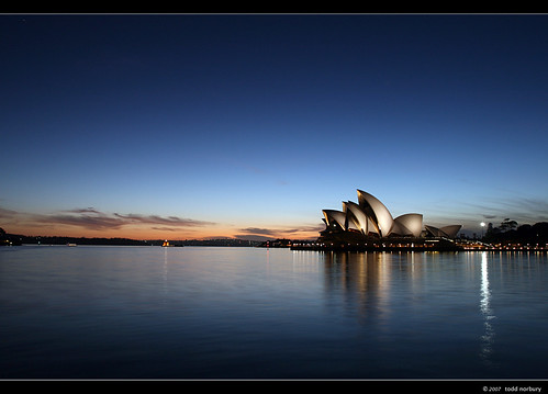
That one seems to be going mad at Flickr. It is slightly different to the one I posted yesterday.
C&C welcome as usual. Especially like to hear if people like it more than the other one. Becasue I dont LOL
A discussion forum - and more - for users of Digital Single Lens Reflex cameras.
Early morning walk. Pt IIModerators: Greg B, Nnnnsic, Geoff, Glen, gstark, Moderators
Forum rules
Please note that image critiquing is a matter of give and take: if you post images for critique, and you then expect to receive criticism, then it is also reasonable, fair and appropriate that, in return, you post your critique of the images of other members here as a matter of courtesy. So please do offer your critique of the images of others; your opinion is important, and will help everyone here enjoy their visit to far greater extent. Also please note that, unless you state something to the contrary, other members might attempt to repost your image with their own post processing applied. We see this as an acceptable form of critique, but should you prefer that others not modify your work, this is perfectly ok, and you should state this, either within your post, or within your signature. Images posted here should conform with the general forum guidelines. Image sizes should not exceed 950 pixels along the largest side (height or width) and typically no more than four images per post or thread. Please also ensure that you have a meaningful location included in your profile. Please refer to the FAQ for details of what "meaningful" is.
Previous topic • Next topic
6 posts
• Page 1 of 1
Early morning walk. Pt II
That one seems to be going mad at Flickr. It is slightly different to the one I posted yesterday. C&C welcome as usual. Especially like to hear if people like it more than the other one. Becasue I dont LOL
Norbs - what is there not to like about this shot?
I don't believe it's cliche in the slightest. Horizon is straight, lighting seems perfect and the colours are neither dominating or too weak. I like this a lot! Well done. Geoff
Special Moments Photography Nikon D700, 50mm 1.4, 85mm 1.4, 70-200 2.8VR, SB800 & some simple studio stuff.
Beautiful shot - great transition from dark to light to dark again. I think it's the orange reflection from the inside of the shells that's so unique about it - give the building a shape rather than a profile?
another ripper opera shot
colours and comp are great i reckon Nikon D70
12-24 DX, 18-70 DX, 70-200 VR 20" iMac Intel C2D Aperture 2.1 PS CS3 http://www.jamesrobertphotography.com
Previous topic • Next topic
6 posts
• Page 1 of 1
|


