And the colour version - which do u prefer?
A discussion forum - and more - for users of Digital Single Lens Reflex cameras.
Getting Ready...Moderators: Greg B, Nnnnsic, Geoff, Glen, gstark, Moderators
Forum rules
Please note that image critiquing is a matter of give and take: if you post images for critique, and you then expect to receive criticism, then it is also reasonable, fair and appropriate that, in return, you post your critique of the images of other members here as a matter of courtesy. So please do offer your critique of the images of others; your opinion is important, and will help everyone here enjoy their visit to far greater extent. Also please note that, unless you state something to the contrary, other members might attempt to repost your image with their own post processing applied. We see this as an acceptable form of critique, but should you prefer that others not modify your work, this is perfectly ok, and you should state this, either within your post, or within your signature. Images posted here should conform with the general forum guidelines. Image sizes should not exceed 950 pixels along the largest side (height or width) and typically no more than four images per post or thread. Please also ensure that you have a meaningful location included in your profile. Please refer to the FAQ for details of what "meaningful" is.
Previous topic • Next topic
9 posts
• Page 1 of 1
Getting Ready...
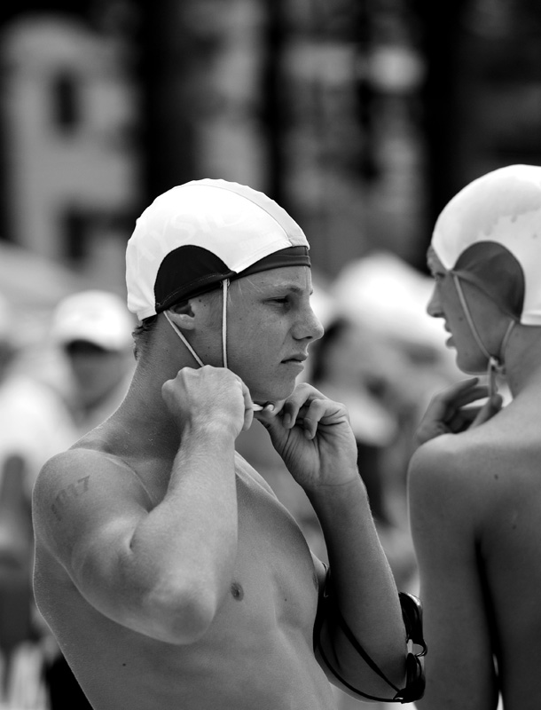
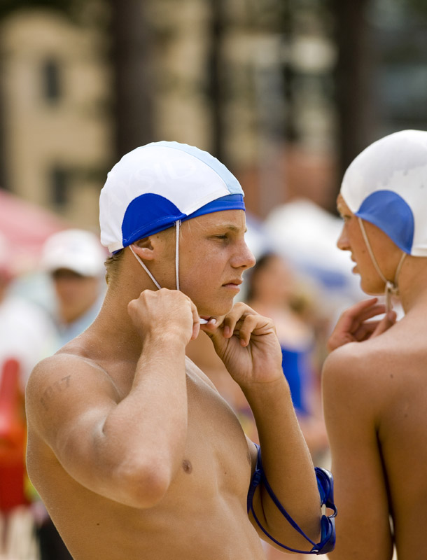
From the surf carnival at Manly Beach today. I thought the mono conversion suited this look of preparation. Taken with the 70-200VR:
And the colour version - which do u prefer? Last edited by Geoff on Sat Jan 27, 2007 5:18 pm, edited 1 time in total.
Geoff
Special Moments Photography Nikon D700, 50mm 1.4, 85mm 1.4, 70-200 2.8VR, SB800 & some simple studio stuff.
Geoff
I always think of shots like this as all gold & red and yellow - bright, warm colours. This image runs so counter to that I just can't relate to it if that makes any sense. Peter
Disclaimer: I know nothing about anything. *** smugmug galleries: http://www.stubbsy.smugmug.com ***
I understand perfectly Peter - I've added the colour version for an unofficial opinion poll
Geoff
Special Moments Photography Nikon D700, 50mm 1.4, 85mm 1.4, 70-200 2.8VR, SB800 & some simple studio stuff.
I'm in a different mind about it than Stubbsy (gee, what a shock eh).
I think that because the other guy next to him is so visible and not out-of-focus, it doesn't warrant the black & white treatment simply because it lacks the solitude his pose would warrant. Post the colour one if you could. I'd like to see the difference. EDIT: Damn. Beat me to it. Producer & Editor @ GadgetGuy.com.au
Contributor for fine magazines such as PC Authority and Popular Science.
Agree with Leigh
If you were to have a closer crop on the guy so the other one wasn't in it, then I think the B&W would work - only problem then becomes where is he looking? Without space on the side he's looking towards, it may become unbalanced (?). The colour one is an improvement on the B&W as it currently stands, because it doesn't rely so much on the solitary nature of B&W - the colour actually makes the image busier, and you get a feeling of intensity despite the busy surroundings. Not sure if this makes sense, it does in my solitary mind *** When getting there is half the fun! ***
Colour with a tighter crop top & right
Peter
Disclaimer: I know nothing about anything. *** smugmug galleries: http://www.stubbsy.smugmug.com ***
Previous topic • Next topic
9 posts
• Page 1 of 1
|


