Page 1 of 1

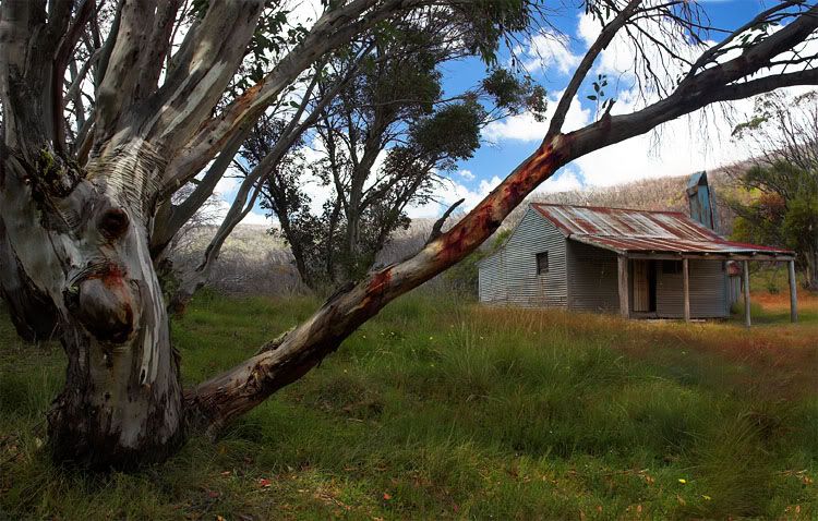
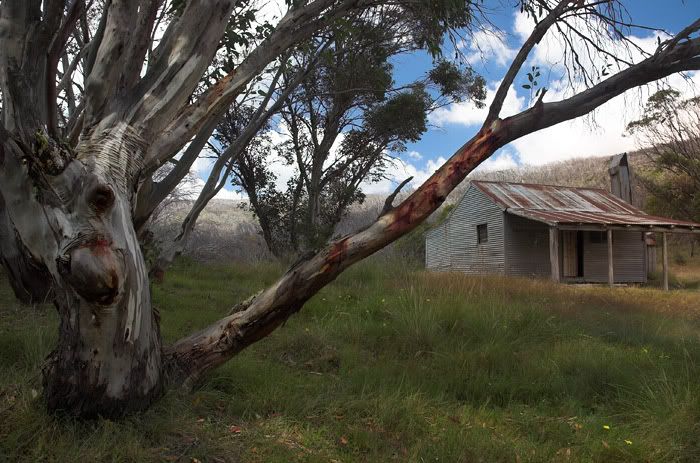
O'Brien's hut, Kosciuszko NP

PostPosted: Sat Jan 28, 2006 2:40 pm
by owen
Hi Guys. Would love to know what you think of this photo. The place is O'briens Hut, located in a rest area off the Alpine Way between Mt Selwyn and Thredbo.

Image

Cheers,
Owen.

PostPosted: Sat Jan 28, 2006 3:26 pm
by sirhc55
Owen - I know some people will suggest lightening up the left hand side but to me it is a fantastic draw from the dark woods to the safety of the hut - I love this shot :)

PostPosted: Sat Jan 28, 2006 3:35 pm
by owen
Hi Chris. Thanks for commenting. I did try to bring the tree out a bit more than what it was in the original photo.

Owen.

PostPosted: Sat Jan 28, 2006 3:35 pm
by Raskill
You've cropped the tip of the verandah off! I think it needs some PP to bring out the colours a little, like the nice reds in the limb of the tree, the green in the grass and blue sky.

Composition wise I like it also.

Post more, it's an area I want to visit one day!

PostPosted: Sat Jan 28, 2006 3:36 pm
by big pix
nice shot just needs a bit more saturation and a tad more contrast.....

PostPosted: Sat Jan 28, 2006 3:52 pm
by owen
Thanks guys. Didn't even notice the tip of the varandah... not exactly somewhere I can go back easily either.

I'll be posting more photos soon as I get organised :)

Cheers,
Owen.

PostPosted: Sat Jan 28, 2006 6:35 pm
by LostDingo
Hi Owen, interesting angle and I understand how difficult this Hut can be to compose. Dead on and it's very much out of balance.

Maybe if you bump the saturation to say +20-+30?

PostPosted: Sat Jan 28, 2006 7:00 pm
by Slider
Great shot. Both the tree and the hut have a heap of character :D

PostPosted: Sat Jan 28, 2006 7:17 pm
by owen
LostDingo wrote:Hi Owen, interesting angle and I understand how difficult this Hut can be to compose. Dead on and it's very much out of balance.

Maybe if you bump the saturation to say +20-+30?


I increased the saturation in the grass slightly... I don't want it to look too false though. It is pretty dry down there.

Will experiment with the idea though, thanks.

Thanks for all other comments too.

Cheers,
Owen.

PostPosted: Sat Jan 28, 2006 7:29 pm
by mudder
G'day mate,

I think the framing using the old tree is a classic and works really well giving great foreground interest, bugger about the clipped verandah :(

Think a smidge more seperation/space between the bough of the tree and the hut itself may help, but difficult to change huh... Just thinking out loud...

The clouds seem a smidge hot, perhaps you could expose another version of the same shot with a lower EV and merge that in the sky area using PP to get more cloud detail?

Classic shot, I'd be like a kid in a candy store there :lol: Love the image mate...

PostPosted: Sat Jan 28, 2006 7:42 pm
by big pix
owen.... just a lttle more saturation and contrast done quickley in LAB color,,,,,,,,,,,,,

Image

PostPosted: Mon Jan 30, 2006 1:16 pm
by owen
Hey guys. Here's another version, complete with a fourth post and better colours :)

Image

What do you think? I think it makes it more complete.

PostPosted: Mon Jan 30, 2006 1:41 pm
by big pix
now your talking........ this image now tells a whole story.......

PostPosted: Mon Jan 30, 2006 2:25 pm
by pharmer
Yeah - thats it, latest one is great, hut is complete, the saturation is right on

Next step perhaps would be a bit of strategic dodge and burn in PS to create a different feel

Fantastic