|
Got a thin skin? Then look elsewhere. Post a link to an image that you've made, and invite others to offer their critiques. Honesty is encouraged, but please be positive in your constructive criticism. Flaming and just plain nastiness will not be tolerated. Please note that this is not an area for you to showcase your images, nor is this a place for you to show-off where you have been. This is an area for you to post images so that you may share with us a technique that you have mastered, or are trying to master. Typically, no more than about four images should be posted in any one post or thread, and the maximum size of any side of any image should not exceed 950 px.
Moderators: Greg B, Nnnnsic, Geoff, Glen, gstark, Moderators
Forum rules
Please note that image critiquing is a matter of give and take: if you post images for critique, and you then expect to receive criticism, then it is also reasonable, fair and appropriate that, in return, you post your critique of the images of other members here as a matter of courtesy. So please do offer your critique of the images of others; your opinion is important, and will help everyone here enjoy their visit to far greater extent.
Also please note that, unless you state something to the contrary, other members might attempt to repost your image with their own post processing applied. We see this as an acceptable form of critique, but should you prefer that others not modify your work, this is perfectly ok, and you should state this, either within your post, or within your signature.
Images posted here should conform with the general forum guidelines. Image sizes should not exceed 950 pixels along the largest side (height or width) and typically no more than four images per post or thread.
Please also ensure that you have a meaningful location included in your profile. Please refer to the FAQ for details of what "meaningful" is.
 by dooda on Thu Jul 28, 2005 6:02 pm by dooda on Thu Jul 28, 2005 6:02 pm
I took a few pics recently and some were sort of experimental. I'd like your thoughts as I find I don't get a very objective view of my own pics. They all seem good to me, albeit a little strange.
I thought to try an overexposure. I know I know, artsy, it's really artsy of me. What do you think? Be honest.

I've taken a real liking to Michael Kenna lately and find myself taking a lot of these pics. I know I'm not quite there, but be brutal with me, is it any good?

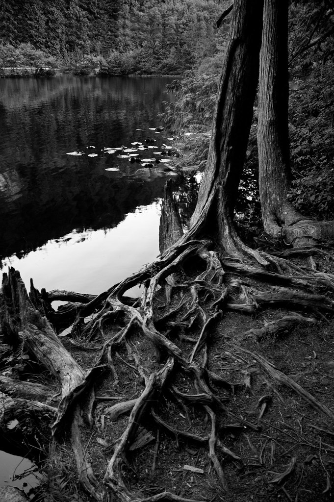
I've always loved taking these photos of roots, but never really understood how to treat them in PP. Here I waited for the subtle light of post sunset and shot a couple different ones. This scene seemed to work out well. Any improvements of composition or anything? Lay it on me.
This one's best viewed large. Hope these aren't too big for anyone.
Finally, I've been working on a series about poles and wires. Here is a pretty good one. Is it too Grey? Is this post way too long? Maybe I should have cut it down a tad.

-

dooda
- Party Animal
-
- Posts: 1591
- Joined: Fri Oct 01, 2004 11:47 am
- Location: Vancouver, B.C. Canada
-
by rokkstar on Thu Jul 28, 2005 6:16 pm
Dooda,
Firstly, I've jsut spent the last 30 mins going through your site looking at your shots which are marvellous. You have some absolute gems on there.
Secondly, I like the second shot, I love michael kenna too. I'm not too keen on the OE first one though I'm afraid.
I would perhaps crop the final one a bit - making it a little wider (if you know what i mean) .
Good stuff
Matt
-

rokkstar
- Senior Member
-
- Posts: 1432
- Joined: Mon Jan 10, 2005 4:27 pm
- Location: Miserable cold wet England - D200
-
by gleff on Thu Jul 28, 2005 6:19 pm
I'm not sure why, but looking at the first shot makes me thirsty 
Personally, the top right hand side is too overexposed for my liking, but perhaps doing some 'shadow and highlights' adjustment in PS may improve it.
I really like the last shot with the railroad tracks though.. really well composed.
Geoff http://www.gleff.com
_________________
D70, 18-70 kit , 80-400VR, 24-120VR, Sigma 10-20, SB800, Benro A328, KB-2 Ballhead
-

gleff
- Senior Member
-
- Posts: 502
- Joined: Mon Jan 24, 2005 1:49 pm
- Location: Chatswood, NSW - Nikon D70
-
by dooda on Thu Jul 28, 2005 6:22 pm
Thanks Rokkstar. I'm glad you took the time to check out some of my stuff. I also appreciate the crit. The last crop, you mean crop the bottom out some? I sort of kept it in because I liked the sand that turned into the railway track, do you think I should get this shot in horizontal?
-
dooda
- Party Animal
-
- Posts: 1591
- Joined: Fri Oct 01, 2004 11:47 am
- Location: Vancouver, B.C. Canada
-
by rokkstar on Thu Jul 28, 2005 6:29 pm
I think it works well in portrait but i was just thinking that it might look nice with the horizontal aspects of the shot horizontal.
i.e. the wires and tracks wider.
But, looking back at it I'm not sure it would work.
The lines all converge nicely in it as it is.
Matt
-
rokkstar
- Senior Member
-
- Posts: 1432
- Joined: Mon Jan 10, 2005 4:27 pm
- Location: Miserable cold wet England - D200
-
by robboh on Thu Jul 28, 2005 6:54 pm
I like these Dooda.
Maybe you could try an 'Ansel Adams effect' treatment to the last one that I have in a book here.
Do an adjustment layer - channel mixer. set the output to Gray. Start with Red @160, Green @140, Blue @-200 (they should add up to around 100%) and then play from there. See what ya think?
Smile; it makes people wonder what you have been up to.
-

robboh
- Member
-
- Posts: 455
- Joined: Wed Apr 06, 2005 7:50 pm
- Location: Auckland, New Zealand
-
by Greg B on Thu Jul 28, 2005 7:10 pm
Nice work dooda.
#1 - I like the OE look, I think it gives an interesting quality. The top right corner is completely blown, but I don't think it matters too much here.
#2 - not so keen on this one. Don't know Michael Kenna, but I'll check him out.
#3 - Love this one, it has that intense BW detail, particularly around the roots of the tree, that bring back memories of the Zone system, Adams et al
#4 - Love this one too, could be from the southern states of the USA c.1930. The greyness complements the mood I think
Good stuff
Greg - - - - D200 etc
Talent hits a target no one else can hit; Genius hits a target no one else can see.
- Arthur Schopenhauer
-

Greg B
- Moderator
-
- Posts: 5938
- Joined: Fri Sep 03, 2004 7:14 pm
- Location: Surrey Hills, Melbourne
-
by leek on Thu Jul 28, 2005 7:14 pm
Nice shots Dave,
Not so keen on the blown sky in #1, but the rest of the shot is nice...
#2 is appealing, but there's something distracting in the middle distance there...
I love #3 & #4 and would have them hanging on my wall...
Can you let me know how you did the B&W processing for #3??? It looks great.
-

leek
- Senior Member
-
- Posts: 3135
- Joined: Thu Dec 23, 2004 4:46 pm
- Location: Lane Cove, Sydney
-
by dooda on Thu Jul 28, 2005 7:29 pm
I do most of the work in the rw plugin. I desaturate and move the contrast slider fairly high, 70-100 or so. Then I go to the color saturation sliders, and I find that in nature, there seems to be a lot of blue, and working the blue slider seems to bring out a lot of contrast. The red does too to an extent, and I work them all in turn until I have it right.
After the plugin I go to adj layers hue and saturation. Tic the colorize box and give it a little bit of color. Generally the saturation between 4-10, 5 or 6 usually, and the color depends, usually a little red or yellow.
Thanks for the comments everyone. I was particularly curious about the blown pic. I might play with the technique a little and see what I can get with this. Might be on to something.
-
dooda
- Party Animal
-
- Posts: 1591
- Joined: Fri Oct 01, 2004 11:47 am
- Location: Vancouver, B.C. Canada
-
by wendellt on Thu Jul 28, 2005 7:30 pm
Hi Dooda
Excellent work
number 1. Looks intentionally overposed which gives it a surreal look, although i agree with 'leek' the blown sky makes you think the scene is much bigger but it also detracts from what is happening at the bottom of the picture
3. Ansel Adams would grin, You should publish or frame this. Would have looked cool if you could have caught a reflectin of yourself in the water.
4. The distant mountains look sunlit but the foreground is flat, this is a nice balance but maybe it would look better cropped so the mountain in the background does not look so far away this is the most interesting part of the picture. The train lines and power cables marry the foreground with the distant mountain, well spotted and executed very well.
-

wendellt
- Outstanding Member of the year (Don't try this at home.)
-
- Posts: 4078
- Joined: Sun Feb 20, 2005 10:04 am
- Location: Dilettante Outside the City Walls, Sydney
-
by dooda on Thu Jul 28, 2005 7:37 pm
Roboh, funny, I did what you said and it came out exactly like the old one, but looked very different from the one posted on this thread. It must have gotten washed on on the upload. I thought I had that all worked out, but I've forgotten what color codes I had it set to. Crap.
Thanks for the comment wendelt. I 'm thinking of going back there when the sun is setting on the entire frame, then backing up quite a bit and then zooming it in to compress the image somewhat, as the wide angle sends the mountain peak back a ways. I appreciate the comment.
-
dooda
- Party Animal
-
- Posts: 1591
- Joined: Fri Oct 01, 2004 11:47 am
- Location: Vancouver, B.C. Canada
-
Return to Image Reviews and Critiques
|
